Software spotlight: The Artwork of Software
It's nineteen eighty-something and you just bought a shiny new box of software. Everything about the package is designed to make you feel good about your purchase. The shiny shrink wrap. The friendly abstract image on the front of someone happily surrounded by words and numbers and the old physical tools this software will replace. The product details on the back that describe what is special about this software. The pleasant "new stuff smell" upon opening the box. A concise brief welcome guide. A professional looking manual that include a friendly tutorial, a well written user guide, followed by all the technical detail you will need later on. And a shiny set of floppy disks with embossed company logos as if to certify quality.
These days all you get is a fat animated seizure-inducing "download" button.
As such, I have posted my "database" of software artwork, mostly leached from eBay photos. Most of the images are from items listed on the "seen on ebay" thread. I've found it useful over the years when trying to determine what was supposed to be included with software products that have been contributed without art.
https://winworldpc.com/product/someguys-software-artwork-database

So why is "artwork" important? And what have we lost without it?
First of all, I feel that having a photo or scan of an item helps create a better mental connection to a software product. It is no longer just a generic virtual container of ones and zeros. It is now something that someone sold, bought, and used for some specific purpose.
On Winworld, we try to make a point to archive as much product "artwork" as possible. This includes Box Covers, Manual covers, floppy disk labels, and other miscellaneous items that may be included. Manual scans may also contain "art" but are usually more important for providing critical information needed to operate or understand the software.
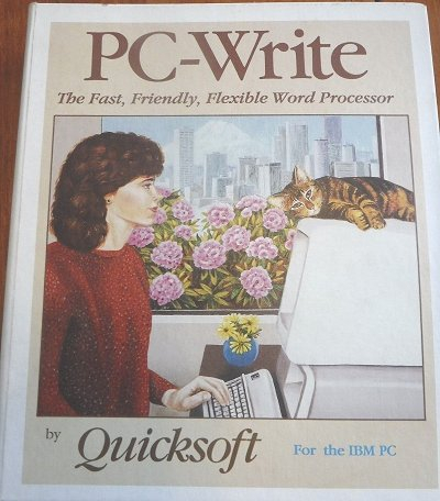
First impressions are important, and the front of the box is usually where this is made. Fancier box art tries to convey an abstract idea of what the software is all about. It usually tries to be eye catching yet professional. Physical boxes were, after all, to be displayed in public places.
A number of styles were possible - generic, serious, humor, visually dazzling.
Box art and logos were often part of larger marketing efforts. For example, box art images may have been reused on advertisements, posters, coffee mugs, and so on. The art, therefore, may try to be something that people will easily recognize.
Looking back at some of these boxes, many of the 1980s boxes used geometric art or just fancy text layout. It was more the style of the 1990s to try and use a busy visual abstract image to convey the product's nature.
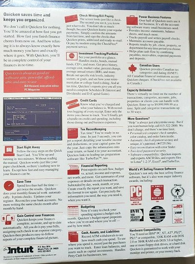
The back of software boxes are very underrated. Both the back and the side may contain product descriptions that appear nowhere else, not even in advertising or in the manual.
Usually the back of the box describes:
- What IS this software product?
- What unique features did the vendor think was most important about the software?
- How did it compare to competing products?
- A list of abilities and features you could use to evaluate if it met your needs.
- System requirements and recommendations.
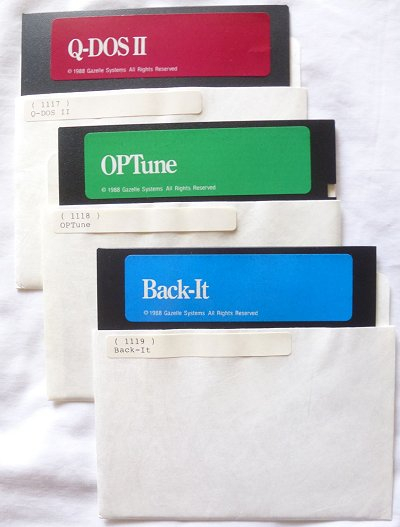
Floppy disks/CDs
You bought a product that is made up of ones and zeros, and the floppy is physical embodiment of that product. So why not make it look nice? Give the customer a "nice shiny" something for their money. Some professional artwork could make the difference between keeping the disks, and reformatting them to store 16-color EGA porn.
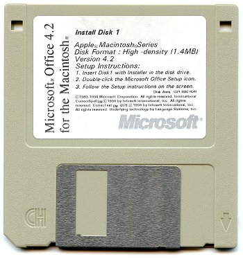
Even when a floppy disk label looks boring, it can hold valuable information. On occasions, the label may be the only place that indicate the exact software version. A label may hint at when and where a particular disk was produced. Often a disk label may include part numbers that may indicate what packaging it was bundled with, or specific variations of the software content.
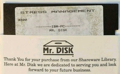
Software titles produced in low numbers may have very generic artwork, if any. Budget software or shareware might use address labels printed on a home printer, and sold in a plastic bag. Early Microsoft products often have a generic green 3-ring binder, the product title printed on a sticker, and generic template floppy labels.
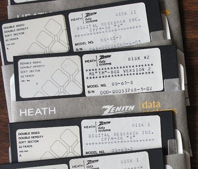
Some vendors intentionally made generic "art". Notably, almost every single Zenith floppy disk is printed on an impact printer - why? One word: MILITARY.
In a military environment, constancy and conformity is key. Distracting artwork, odd sized manuals, hard to read labels, or inconstant layouts can cost lives. Usually yours.
All floppy disks are labeled consistently with product name, product number, and serial number. All manuals are consistent color, size, and labeled with the same fonts. Prominent product numbers makes reorder or replacement quick and efficient.
It does lead to some ambiguities, however. Due to whatever political or contractual reason that kept the "Z-100" name when they switched to IBM PC compatible hardware, in some cases the product number is the only way to distinguish if a software title is for the original "Z-100" or the "Z-100 PC".
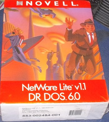
Of course, to a real collector, nothing beats having a genuine physical item. The feel of a box's cloth exterior, the shine of a real factory made floppy label, or the feel of having software physically at your fingertips under your own control rather than some distant "cloud".
These days all you get is a fat animated seizure-inducing "download" button.
As such, I have posted my "database" of software artwork, mostly leached from eBay photos. Most of the images are from items listed on the "seen on ebay" thread. I've found it useful over the years when trying to determine what was supposed to be included with software products that have been contributed without art.
https://winworldpc.com/product/someguys-software-artwork-database

So why is "artwork" important? And what have we lost without it?
First of all, I feel that having a photo or scan of an item helps create a better mental connection to a software product. It is no longer just a generic virtual container of ones and zeros. It is now something that someone sold, bought, and used for some specific purpose.
On Winworld, we try to make a point to archive as much product "artwork" as possible. This includes Box Covers, Manual covers, floppy disk labels, and other miscellaneous items that may be included. Manual scans may also contain "art" but are usually more important for providing critical information needed to operate or understand the software.

First impressions are important, and the front of the box is usually where this is made. Fancier box art tries to convey an abstract idea of what the software is all about. It usually tries to be eye catching yet professional. Physical boxes were, after all, to be displayed in public places.
A number of styles were possible - generic, serious, humor, visually dazzling.
Box art and logos were often part of larger marketing efforts. For example, box art images may have been reused on advertisements, posters, coffee mugs, and so on. The art, therefore, may try to be something that people will easily recognize.
Looking back at some of these boxes, many of the 1980s boxes used geometric art or just fancy text layout. It was more the style of the 1990s to try and use a busy visual abstract image to convey the product's nature.

The back of software boxes are very underrated. Both the back and the side may contain product descriptions that appear nowhere else, not even in advertising or in the manual.
Usually the back of the box describes:
- What IS this software product?
- What unique features did the vendor think was most important about the software?
- How did it compare to competing products?
- A list of abilities and features you could use to evaluate if it met your needs.
- System requirements and recommendations.

Floppy disks/CDs
You bought a product that is made up of ones and zeros, and the floppy is physical embodiment of that product. So why not make it look nice? Give the customer a "nice shiny" something for their money. Some professional artwork could make the difference between keeping the disks, and reformatting them to store 16-color EGA porn.

Even when a floppy disk label looks boring, it can hold valuable information. On occasions, the label may be the only place that indicate the exact software version. A label may hint at when and where a particular disk was produced. Often a disk label may include part numbers that may indicate what packaging it was bundled with, or specific variations of the software content.

Software titles produced in low numbers may have very generic artwork, if any. Budget software or shareware might use address labels printed on a home printer, and sold in a plastic bag. Early Microsoft products often have a generic green 3-ring binder, the product title printed on a sticker, and generic template floppy labels.

Some vendors intentionally made generic "art". Notably, almost every single Zenith floppy disk is printed on an impact printer - why? One word: MILITARY.
In a military environment, constancy and conformity is key. Distracting artwork, odd sized manuals, hard to read labels, or inconstant layouts can cost lives. Usually yours.
All floppy disks are labeled consistently with product name, product number, and serial number. All manuals are consistent color, size, and labeled with the same fonts. Prominent product numbers makes reorder or replacement quick and efficient.
It does lead to some ambiguities, however. Due to whatever political or contractual reason that kept the "Z-100" name when they switched to IBM PC compatible hardware, in some cases the product number is the only way to distinguish if a software title is for the original "Z-100" or the "Z-100 PC".

Of course, to a real collector, nothing beats having a genuine physical item. The feel of a box's cloth exterior, the shine of a real factory made floppy label, or the feel of having software physically at your fingertips under your own control rather than some distant "cloud".

Comments
I have in front of me the retail box for V-Com SystemSuite 5. It was catchy, and even had a fold out 'wing" on the box front, like opening the cover to a book.
The whole thing had a shiny finish to it, adding to the glitz aspect of owning (excuse me, renting) what was basically a little toolbox with a hammer, screwdriver, pliers.
Pretty much most software companies really thought out the box as many would be sitting on shelves next to competing software AND knowing how 'visual' people are..
Nowadays these values changed greatly you must choose the least offensive 'tranny' on the cover of the software (or beer)...