What the hell, YouTube?
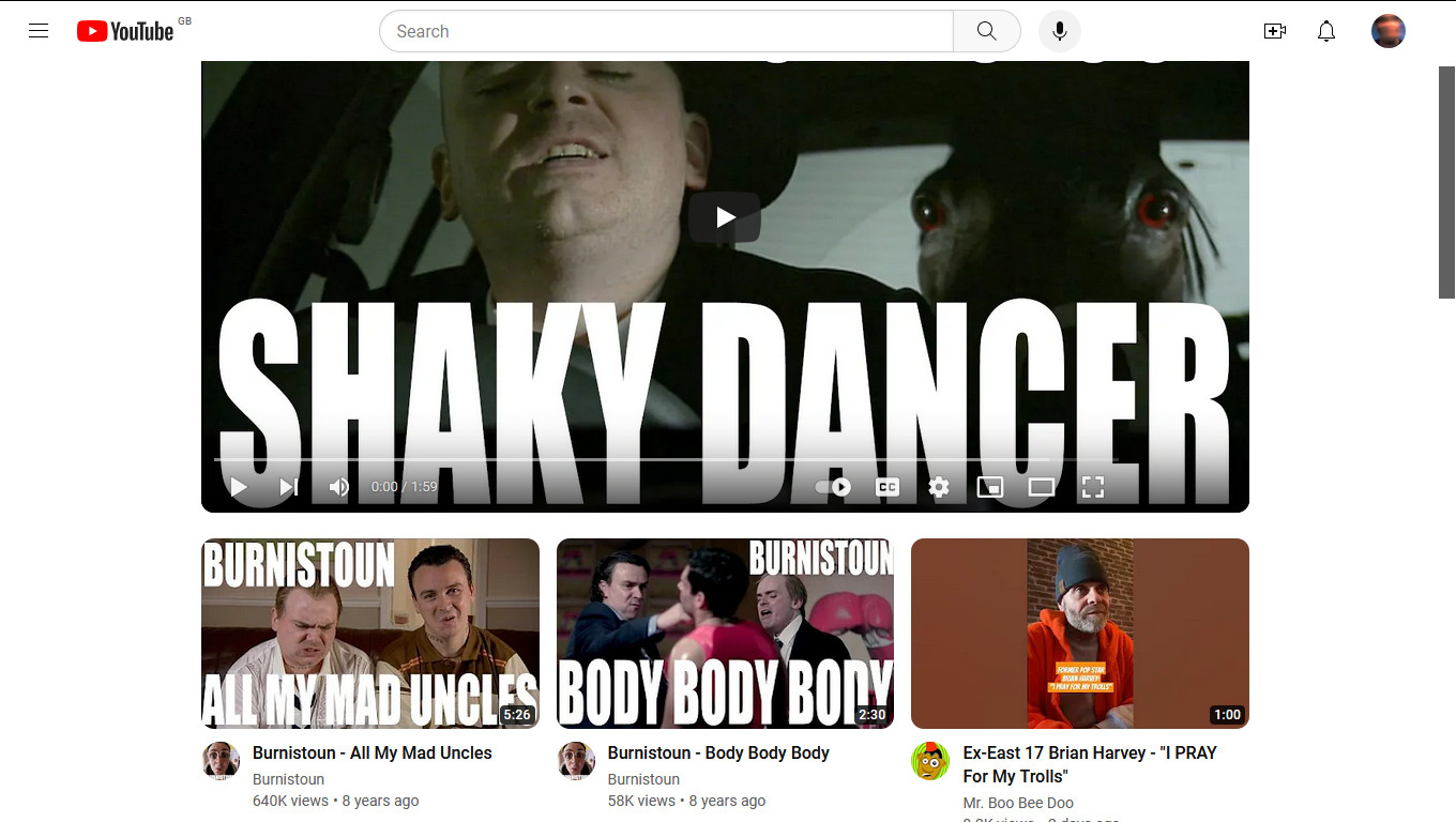
I've been up in arms about every stupid thing Google has done to YouTube over the years, but what I saw today, I just couldn't believe my eyes. When you watch a video, you now see more videos stacked at the bottom of it as by this humble screenshot below:

Looks like YouTube's becoming more like TikTok or some other scummy social media site where you have a lot of videos as part of this annoying and unnecessary "infinite scroll". Because of this, and with no idea how to get rid of it, I may stay away from the site for good (I have a channel though, so I would just abandon it rather than delete it). That's on top of the ads it forces on its users to now trying to disallow me to upload videos just because I use an older browser (still refuse to upgrade Firefox, even though that's nearly two years now).
Wouldn't be surprised if anybody else vents about it...

Comments
I noticed when logging in to a Gmail account the other day that there was some message that they were going to give the google login page a more "modern" look.... *shudders*.
I don't have a TV or cable service - just internet, so I munch on YT quite a bit.
Although, I remembered I made two custom filters with uBlock origin on the site years ago (to hide the annoying sidebar) so I removed these and now it looks like this:
This also looks the same on Edge so... I don't get what's going on. Could it be my screen resolution?
Also @SomeGuy, probably because YouTube is the only site they know... as far as I'm aware, there's no other video-sharing site as big as it. And yes, I saw that "modern look" teasing the other day. I'm not holding my breath as to what it is...
Although I can't seem to get it to look how it was before, I did use uBlock origin to zap away the recommended videos bit beneath the video that I'm watching with this filter (and apparently much different to the plain "secondary" filter that I used for many years, which "broke" the new look in the first place):
www.youtube.com##.ytd-watch-next-secondary-results-renderer.style-scope > .ytd-rich-grid-renderer.style-scopeSo, all is fine... for now anyway.
www.youtube.com##ytd-rich-grid-renderer.ytd-watch-grid.style-scope > .ytd-rich-grid-renderer.style-scopeAnd today, they've brought it back again at the side, hence me needing to filter it out with
www.youtube.com###secondary, which is the exact same one I had since four years ago until that cock-up at the start of the month.It seems to be that YouTube is aware that people are using filters to block things out nevermind their stupid ads that they try to force them on... and that's not good.