Chicago build - real or just a concept?

edited December 2016 in Software
During the time of Chicago Beta 1, there was a guide released for testers, and it has one image of a Chicago build which has puzzled me for quite some time now.
Take a look: chicagolanguages.gif
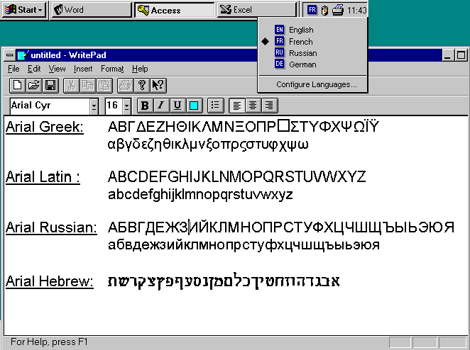
Yes, it looks somewhat like a real build, BUT: it doesn't match up with any known build, primarily because of the GUI: it has the window controls of build 73, but the Start menu of build 81. So, either it's a lost build in between 73 and 81, or just concept art. (Then again, the beta scene found build 99 through that very same document.)

What do you think? A real build, or just an idea?

Comments

  • I'd say it is probably a bit of both. They did do a lot of cut and pasting in that document, and some of that may have been recycled mockups or concept art. But being Microsoft some of the bits could have come from random prototypes or early builds.
  • The fact that the taskbar doesn't reach the full width of the screen, I'd say that's just a concept.
  • Here is some information from Raymond Chen in his book "The Old New Thing":
    Why does the taskbar default to the bottom of the screen?

    IT DIDN'T ALWAYS.

    The original taskbar didn't look at all like what you see today. It defaulted to the top of the screen and looked something like this:
    oldnewthingtab.png
    This is definitely not what it actually looked like. It has been so long I forgot precisely what it looked like (I didn't realize there was going to be a quiz ten years later), but this captures the basic flavor, at least for the purpose of this discussion.

    The point is that the bar took the form not of buttons, but of tabs. Each tab corresponded to a running window, which melded into the tab. You switched windows by clicking the corresponding tab.

    You can see vestiges of this style in the TCB_BUTTONS style in the tab control. When we switched to the button look for the taskbar, we still had a lot of switching code based on the tabs metaphor, and it was less work to add a button look to the tab control than it was to rewrite all the switching code.

    The tabbed look was abandoned for many reasons, one of which was what many people have noticed on their own: If you put the taskbar at the top of the screen, lots of windows end up sliding under it, because they assume that the usable area of the screen begins at (0, 0). Other windows "creep" up the screen because they use GetWindowPlacement to save their window position (which returns workspace coordinates, where (0, 0) is the first usable pixel) but use SetWindowPos to restore it (which uses screen coordinates, where (0, 0) is the upper-left pixel of the primary monitor).

    Too many apps kept sliding under the top-docked taskbar, so we had to abandon that idea and move it to the bottom.

    It's somewhat disheartening to observe that now, ten years later, apps still mess up their coordinate systems and keep sliding under a top-docked or left-docked taskbar.
    It appears that the screenshot posted in the original post was between these two stages (shortly after the "tabs" were turned into buttons, but before actually being moved to the bottom of the screen).
  • Personally, I like the sound of tabs within the taskbar. Seems rather unique at its time. The first screenshot in the original post however is... a bit odd. Was the taskbar meant to be that short, and not be the same width as the desktop itself? And would it expand when more programs are loaded in it? And more importantly... is that two Minimise buttons I see on that window? :|
  • That specific image is definitely a paste-up. The taskbar doesn't match what resolution it is, let alone what windows are open. The question is what builds did this bits all come from, if not completely fabricated.
  • I'd say they took the start menu from 81 and the window controls from 73. And two minimise buttons? Well, it's just the 3.1 controls, with a different icon and style. So no, not really.
Sign In or Register to comment.