A new logo for winworld! (idea)

The winworld logo is gone. so i have a new win world logo! (https://forum.winworldpc.com/uploads/editor/8h/08qsbicmui3z.png "")
The winworld logo is gone. so i have a new win world logo! (https://forum.winworldpc.com/uploads/editor/8h/08qsbicmui3z.png "")
Comments
That is very low priority, there are plenty of other tweaks and improvements that yet need to be made. And none of us are very good at PhotoShop.
But a few thoughts: NO Microsoft logo. This site is much more than Microsoft crap.
Perhaps a graphic of an IBM Model M keyboard, that we will use to hit anyone over the head if they think this place is Twatter, and won't post more than 140 characters and/or rapidly multiposts.
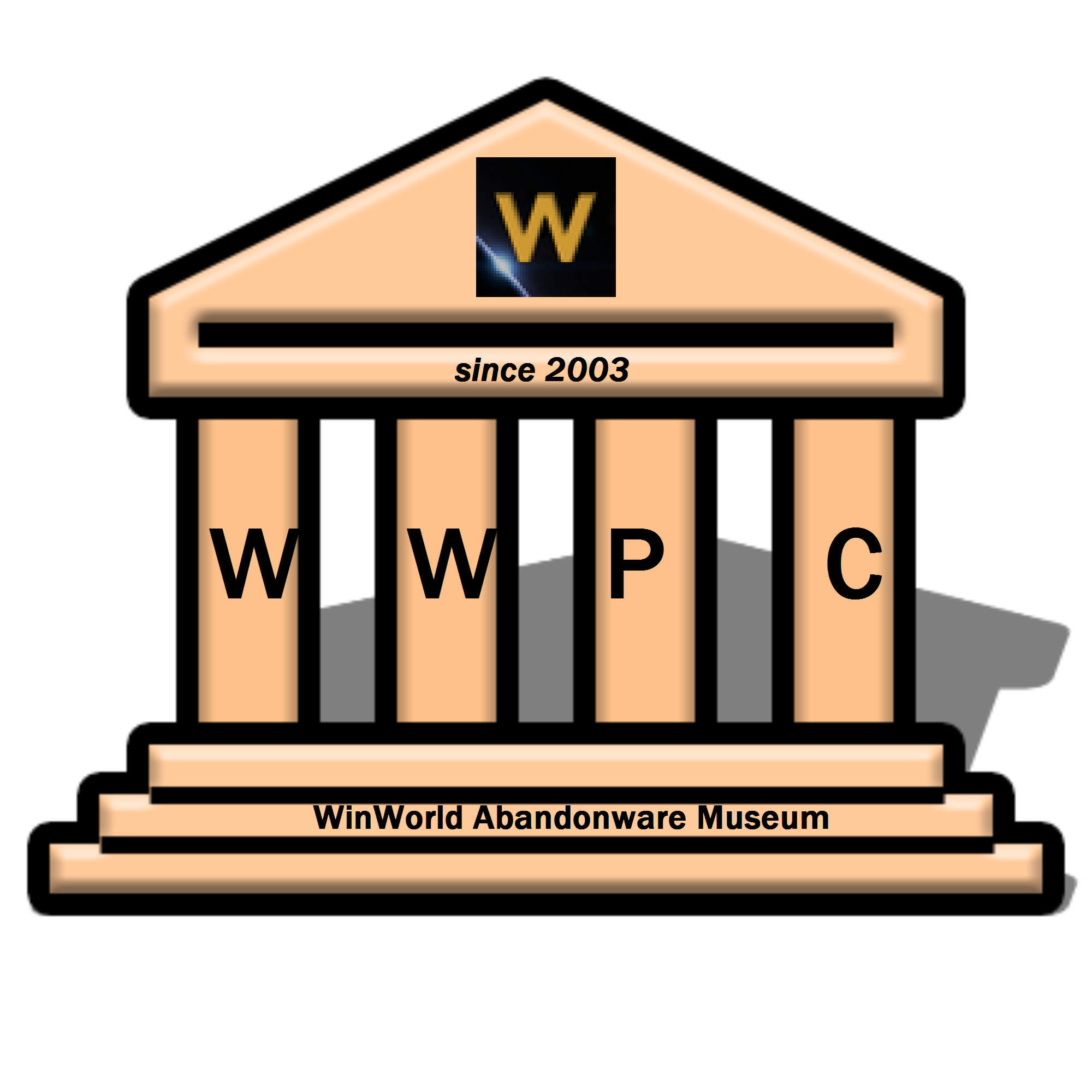
Personally, I like the imagery of roman columns or pedestals. Those kind of say "museum". Perhaps something with floppy disks or green-screens. I would say pictures of IBM/Mac systems, but the Vetusware forum already kind of does that.
This is... not very good. Looks like it's been done in only a few minutes. And, I can't help but think the logo always reads as "worlbd". Maybe I can do something, as I've done logo design in the past.
We are in need a new logo however as SomeGuy said no Microsoft logos or anything trademarked.
That logo in particular does look like something thrown together in a couple minutes. That being said, my graphic design skills aren't much better. So if someone wants to take a crack at designing a new logo, go for it.
Use the ideas SomeGuy mentioned, and have it scalable, SVG would be ideal. We want a logo and icon that can be used everywhere from the main site (dark or light) to Twitter to fav/touch icons.
I remember a guy on IRC who created a really cool logo a while back. You may want to take a look at that. (Spriteclad, I think.)
So, it's the logo and favicon you want? And as for the logo, does the size of it matter?
Okay, I've done it... three of them in fact, in this zip folder below. Though I did my best, I can however explain the design concepts of them... the first is meant to evoke "museum" like what SomeGuy wanted and the second is meant to be a combo of a floppy and ZIP disk. The third, just something simple loosely based on the favicon of the main site. And just so everyone knows, both a PNG and SVG are in this attached folder, and Duff can choose which seems the best and more effective out of them.
I still have the SVG on my system should I work on any of them again.
Better?
i regret this. (im a 9 year old. happy now?)
tried again. pls help me.
As SomeGuy had stated, the new logo must NOT include Windows' logo, or even Linux's mascot either. You may have tried but I'm going to be blunt... you've not done good enough. Both look like quick masterpieces done in MSPaint.
With that said, nobody's said anything about my attempts even though I at least tried, as someone who had dabbled with graphic design for almost nine years. If any of mine may not live up to what either @SomeGuy or @Duff want, I can always do improvements no bother.
My idea of logo (But needs be made with Photshop, made in Paint in 10 minutes)
Looks quite good! For the first logo, I suggest adding a horizontal bar beneath the three pillars of the museum (similar to the Internet Archive's logo). Without it, it looks like (to me) a rocket launching into space.
@SomeGuy:
My ideas attached. Remember-- they're just starters; feel free to improve them as you wish.
EDIT: Maybe I could have these images displaying on a computer screen? Hmm...
Experiment #1: (CRT screen; original images below)


Favicon:
Logo 1:
Logo 2:
Eh, didn't think about that. I'll keep that in mind but :P
Although, if we were using a space theme, a logo that looks both like a museum and a space ship could actually work.
Never thought of that! Good idea.
Any comments on the logos I put together?
Been tinkering with Illustrator CC lately, recreating Windows 95/98/2000 vector logos. This thread gave me an idea!
I think the resemblance to win95 works here very well
that looks much cooler than mine!
they where made in ms paint. im going to use paint.net soon.
Different software =/= Better
the metrics seem a bit off on the last ones, but I like where you're going with it
To whom (or who?) are you addressing this post to? (There's no @user included in your post)
Here's the source for the old logo if you're interested in using it / modifying it.
I have a couple ideas for a new logo for WinWorld. I made both logos in Adobe Photoshop. I'm actually a pretty good designer.
So without further of due, here are my suggestions for the new WinWorld logo...
Or...
Get it? Because WinWorld is a museum filled with downloads for ISO images (mostly), so the first one would be great. And I decided to have the WinWorld logo on a floppy disk, since that's what WinWorld also has, which means my second pic could also be okay to have as the new logo.
I quite like the first one, @JonathonWyble. It would represent what this community's all about well")
Are these logos all right? Have not made it with Paint.
@MacInTosh Nice logos. Unfortunately, both SomeGuy and Duff said that the WinWorld logo cannot have any logos from companies like Microsoft, because WinWorld has more than just Microsoft content. But I do like your second logo.
Here is:

Tada !!!
I just made a small tweak to my first logo idea,
I decided to have the disc where the "o" in "WinWorld" is because I just thought that having the picture of a disc next to the word WinWorld was a little cringe.
The O thing is from an old Microsoft logo. It’s not advisable to use it; it may still be under copyright.