I think having this dark space theme is a great idea, because that's how WinWorld always looked, ever since the beginning. Maybe you could find a way to add stars in the background as well.
However, one disadvantage of the dark space theme is that it used to sometimes make me a little nauseous, going from the WinWorld tab to a tab with a white layout. This was prior to the reset in 2017, way before I had my WinWorld account, but I did use the site to download stuff at that time.
To be honest, I'm used to the default look for this site now (maybe because I prefer light themes over dark) but this is good for anyone to reminisce of the good ol' days
I've been making something that shows quite a bit of suggestions for the this "WinWorld classic" theme. These contain some features that may not already be included in WinWorld.
Yes, I included the new WinWorld logo
And along with that, I also made a suggestion for how the forum would be like with this theme.
Went ahead and pruned it for you. If you hover your mouse over a post, a small "gear" icon will appear in the upper right that you can click on to bring up a menu that should let you edit or delete a post for up to a couple of hours after posting it.
Apparently that is somehow "better" than just having an "Edit" or "Delete" link directly on the post.
How do we turn this off? I don't see any options under my profile. Also, it makes the mobile web browsers forced to use the mobile layout, there isn't a way to get desktop view.
We are experimenting with theming and trying to improve the text editor, apologies to anyone who is having difficulties, I'll be making a news post shortly. @jafir In Chrome on Android 10, when I enable Desktop Mode in the menu, I'm served the regular desktop site, then toggling it off reverts back to standard mobile layout. What browser/OS are you using?
Hey @Duff, do you (or anybody else) have a time frame as to when you're done with the theming experimentation? I'd rather wait for things to settle down before trying to update my userstyle.
Why do I never get the memo? This makes the forum look like a watered down fisher-price toy. The only plus is, it seem to show the "gear" menu consistently rather than waiting for a mouseover. It does not show me all the details I need when listing the latest posts. I wouldn't mind it hiding the side menu so much, if there weren't a couple of items that do not seem to be listed in the categories page or elsewhere. Like so much mobile shit, I have to maximize by browser for it to show me the side menu.
This is how a real forum should look: http://forums.mozillazine.org/viewforum.php?f=38 I miss PHPBB, but looking at betaarchive's recent update, it looks like even that as gone halfway down the toilet too.
@SomeGuy Mostly because you're not hooked into the development channel on IRC/Discord, for better or worse it's where most of the day-to-day things are.
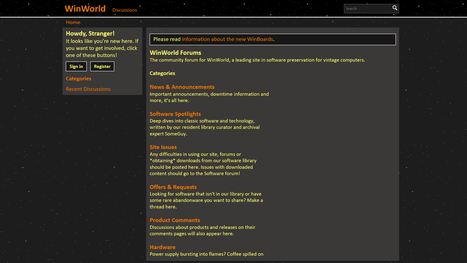
Given everyone seems to dislike the new theme(s) for one reason or another, we'll stick with the Baseline theme until we complete integration with the site proper. We're also using a basic subset of HTML for formatting comments.
I too would love to go back something in the style of phpBB, and hopefully once the theme is complete, it will at least come close to resembling it.
The only things I dislike about the current version of the forum is the "Activity" nonsense, but that's been here forever, and the fact that replies are called "comments".
I haven't seen the most recent theme on desktop yet, but I've seen it on mobile. My only complaint is that unread topics don't stand out as well as they did before. Also, the link to mark all viewed is now hidden, so it's an extra click to get to it. But I can live with it.
Still it's much better than the dark theme. The text was too white which was very harsh against the black background.
Yea, I've got piles of other things going on at the moment (Anyone need an Oracle Forms programmer?), so I don't have time for realtime chat.
So, the specific issues I noted were that the news post list was not showing the "started by" and "most recent" user names, which I kind of need sometimes. It also did not visually differentiate new posts as much. It was stacking some of the menu options vertically, taking up the entire width of my browser window. The issue there appeared to be, like so many many other sites, trying to switch to an oversized "mobile" layout when my browser window is less than about 1024x768, as I normally use it.
Light/dark is not really an issue, as long as everyone else is happy with that.
I would suggest adding a link at the top of the forum to the Winworld library.
I do appreciate the effort that goes in to this. Thanks.
I'll make an effort to duplicate anything critical from the dev channel into a topic in the staff forum going forward. That said, a lot of these improvements are done on a whim, see just about everything done in the past 2-3 weeks by calvin and gravislizard, or my random theme experiments on a boring Monday. Classic WinWorld development schedule.
So for the time being, are we (anyone can comment on this) mostly content with the default forum theme? It seems to be the 'best' for the time being, or at least what everyone is used to.
Hopefully by the end of the summer we'll have theming implemented, with the forums being fully tied into Adventure/the main site, so you'll see the same style of navigation, fonts, etc. Also hoping to bring back some 'classic' phpBB features like proper reply/edit/quote buttons on posts and turning posts with comments' back into proper forum threads.
For now I think the default theme is fine. I really like the design that @JonathonWyble came up with though - it would be nice to see that built into the website in the future.
@nick99nack I'd have to agree! It would be nice to have what I made as the site's design, because that way WinWorld would be the way it has been for many years.
Off-topic comment: I had to mention the OP the simple way because I can't find the "quote" button anywhere.
Comments
Just tried it out and it looks cool!
I really love the old style and missed it. Just stumbled across this topic and tried it. Thank you very much!
And i found a bug. If i search, the highlighted keyword is only visible when marking it. It has same foreground like background I suspect.
Screenshot attached. Maybe you'll fix this. Anyway, thanks again.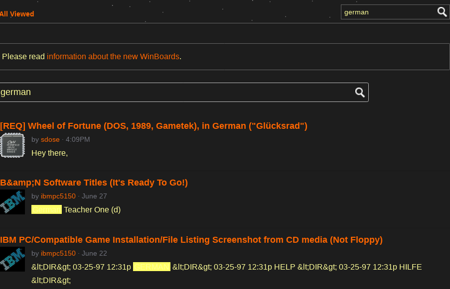
I think having this dark space theme is a great idea, because that's how WinWorld always looked, ever since the beginning. Maybe you could find a way to add stars in the background as well.
@sdose, thanks for pointing that out. There were a few other bugs I wanted to fix anyways.
@JonathonWyble, I haven't updated the screenshot yet, but the starry background is in the header.
Nice to see that you're still around and still interested in your project.
I use github for "long-term-storage" and pushing me to "make-things-right-before-publishing" and from there I know far too much abandoned projects.
However, one disadvantage of the dark space theme is that it used to sometimes make me a little nauseous, going from the WinWorld tab to a tab with a white layout. This was prior to the reset in 2017, way before I had my WinWorld account, but I did use the site to download stuff at that time.
I've moved this into Announcements and stickied it, so it's not buried in the Programming forum.
Thank you very much for this userstyle! I really liked the old website design and this brings me a lot of good memories
Cheers and keep up the excelent work lad.
To be honest, I'm used to the default look for this site now (maybe because I prefer light themes over dark) but this is good for anyone to reminisce of the good ol' days")
Thanks for your marvelous work, @ubuntuxp =D
I missed the classic old dark-orange style aswell. Thanks man.
I've been making something that shows quite a bit of suggestions for the this "WinWorld classic" theme. These contain some features that may not already be included in WinWorld.

Yes, I included the new WinWorld logo
And along with that, I also made a suggestion for how the forum would be like with this theme.
how do i delete comments?
Went ahead and pruned it for you. If you hover your mouse over a post, a small "gear" icon will appear in the upper right that you can click on to bring up a menu that should let you edit or delete a post for up to a couple of hours after posting it.
Apparently that is somehow "better" than just having an "Edit" or "Delete" link directly on the post.
Couldn't we at least give users a dark theme because this might burn people's eyes that are first coming here.
How do we turn this off? I don't see any options under my profile. Also, it makes the mobile web browsers forced to use the mobile layout, there isn't a way to get desktop view.
It looks like the dark mode tired off again, on its own, but I still cannot get the desktop view back on my phone.
@jafir In Chrome on Android 10, when I enable Desktop Mode in the menu, I'm served the regular desktop site, then toggling it off reverts back to standard mobile layout. What browser/OS are you using?
Up until today, there was a link at the bottom of the site I could click that would give me the desktop site.
This makes the forum look like a watered down fisher-price toy. The only plus is, it seem to show the "gear" menu consistently rather than waiting for a mouseover. It does not show me all the details I need when listing the latest posts. I wouldn't mind it hiding the side menu so much, if there weren't a couple of items that do not seem to be listed in the categories page or elsewhere. Like so much mobile shit, I have to maximize by browser for it to show me the side menu.
This is how a real forum should look: http://forums.mozillazine.org/viewforum.php?f=38
I miss PHPBB, but looking at betaarchive's recent update, it looks like even that as gone halfway down the toilet too.
Given everyone seems to dislike the new theme(s) for one reason or another, we'll stick with the Baseline theme until we complete integration with the site proper. We're also using a basic subset of HTML for formatting comments.
I too would love to go back something in the style of phpBB, and hopefully once the theme is complete, it will at least come close to resembling it.
Still it's much better than the dark theme. The text was too white which was very harsh against the black background.
So, the specific issues I noted were that the news post list was not showing the "started by" and "most recent" user names, which I kind of need sometimes. It also did not visually differentiate new posts as much. It was stacking some of the menu options vertically, taking up the entire width of my browser window. The issue there appeared to be, like so many many other sites, trying to switch to an oversized "mobile" layout when my browser window is less than about 1024x768, as I normally use it.
Light/dark is not really an issue, as long as everyone else is happy with that.
I would suggest adding a link at the top of the forum to the Winworld library.
I do appreciate the effort that goes in to this. Thanks.
So for the time being, are we (anyone can comment on this) mostly content with the default forum theme? It seems to be the 'best' for the time being, or at least what everyone is used to.
Hopefully by the end of the summer we'll have theming implemented, with the forums being fully tied into Adventure/the main site, so you'll see the same style of navigation, fonts, etc. Also hoping to bring back some 'classic' phpBB features like proper reply/edit/quote buttons on posts and turning posts with comments' back into proper forum threads.
Off-topic comment:
I had to mention the OP the simple way because I can't find the "quote" button anywhere.